Speak in Corners : My Way to Styling Icons
Published on 12 July, 2024
I hate this type of icon corners.

It looks like somebody designed the icons and then someone else entered the room and decided to file the corners as they “felt” it was too sharp to touch.

Why design it such in the first place? Can simply fucking do this…

But there are places where sharp corners make more sense. So instead of making everything soft post-facto with filed corners, I would rather deliberately design what shall be a sharp corner and what shall be rounded. See this delicious Send icon…
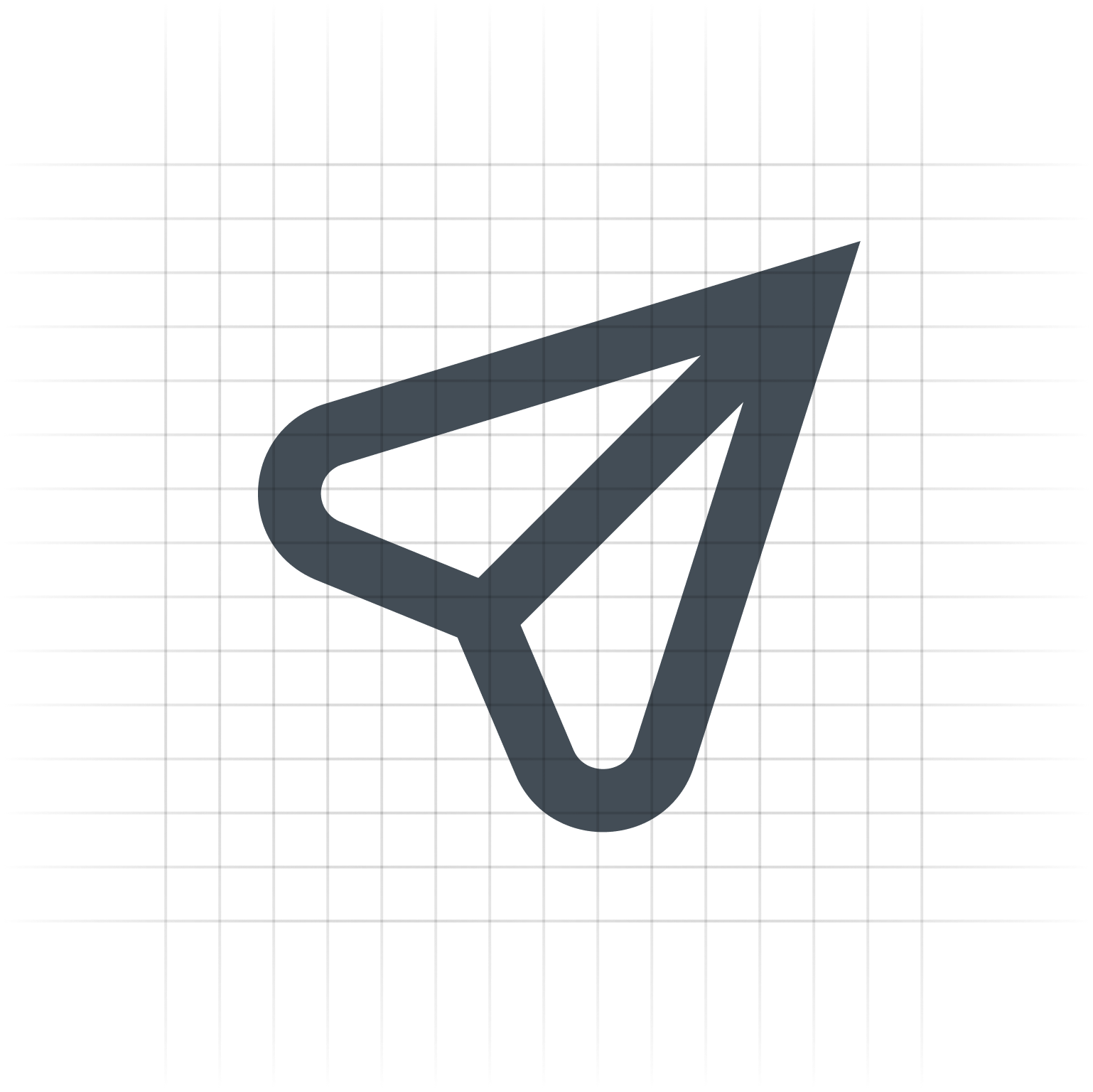
Compare this to a typical send icon these days.

I think this looks more inert compared to mine which looks more energetic.
Okay, we designers just make up those italic words. But point is, most often designers don’t consciously think about the fact that the send icon is based on those paper-planes and paper-planes have a sharp head. Let’s reinforce that inspiration with a dramatically sharp head! It looks more energetic. Your message is going to arrive “quick”. It’s going to be electr-on-ic! Okay, I’ll move on…
The Approach
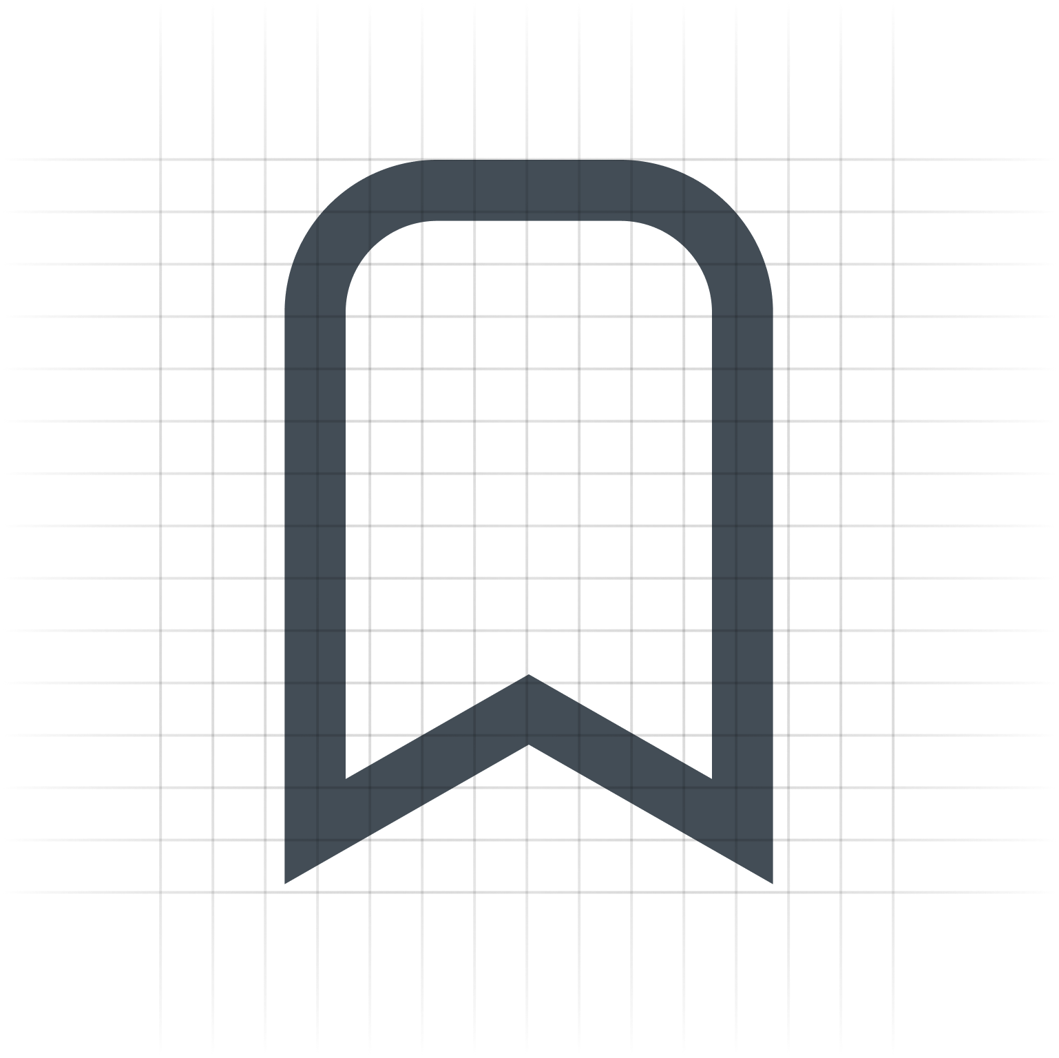
Some Designers reading this might still argue that icons must be soft and friendly, as if normal people have relationships with vectors. But to my fellow designers, I say: Here I imagine when people tap my Send icon, they feel like they are tapping the soft bottom of that plane icon, rather than tapping at an abstract shape. By similar logic, the bookmark icon works well here:
Such interplays of curved and sharp corners is what my latest Icon Pack I am developing is all about. Infact, this is how I will design the icon I opened this blog with :

Making Up Rules
When I was starting out as a designer, I remember we used to have blanket rules for icon-styling like we will have soft friendly corners for icons and components alike, and then every now and then someone will try to be edgy and post a UI Mockup on Dribbble with sharp sophisticated corners. Point is designer invent those italic words to make-up the rules that evoke their idea of a modern aesthetic.

I however differ here.
I think that we shall simply look at the visual variations possible and make up a coherent language out of it. Users love it as long as it makes sense. Anything however seemingly modern is only different until it’s not!
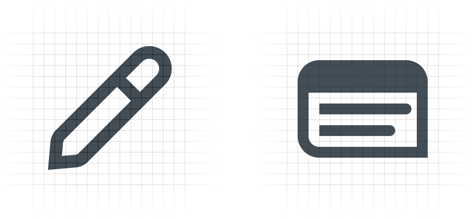
For interplay of sharp and curved icons, here's what the above icon in my new developing Icon Pack looks like :

Because Pencil shall be sharp!
See another comparison of icons for Archive :

Check out these icons now...

But wait! Let’s extend this deliberate approach for corners to stroke ends…
I lied! I did something more to the above App icons. I have been designing icons for an app that has an hand-drawn aesthetic for it’s illustrations due to various functional and stylistic reasons and likewise we picked a font-style with varying width and slanted stroke ends that looks handwritten. As such, instead of presumably putting rounded or flat stroke ends, I did these stroke-ends :


And that’s it. I think we have forgotten something for consumer app iconography. Burdened by Marketing Instincts masquerading as Business Goals you gotta achieve as a designer, we tend to go for whatever feels modern at the time. But I want you to remember :
We shall simply look at the visual variations possible and make up a coherent language out of it. Users love it as long as it makes sense. Anything however seemingly modern is only different until it’s not!
Every corner contributes to this language. Atleast that’s what I think!
I exercise a similar logic to components and other artefacts I design within an app. But that’s a conversation for another blog. Subscribe to receive that in your email.