Minimal Viable Theory for UI and Build Over Buy
#11 Productize Philosophy
Hey, Everyone.
This week, I will be sending you one more letter. Also, I've finally setup my workstation. It will be my place of creation for atleast a couple of years down the line. I don't like clean setups but "seemingly-messy" ones with loads of clever things that constantly stimulate you. "Clean Setups" feels senile, like a Dentist's clinic. I want my environment to be as rich and as saturated as a Rainforest.

Let's get on with today's letter.
🎙 Today's Discourse
Minimal Viable Theory for UI
There are about 100 books in my house right now, and barely a couple of them are what you would call "design books". I like reading about novel product thinking, but I absolutely abhor those who overly-theorize about visual design. It is easy to be blinded by the charm of "aesthetic descriptions", but it is no way of learning visual design. Just like a filmmaker should experience more novels and other life experiences than reading "filmmaking" books, I think a designer should simply experience more "designs" and directly absorb from them.
Firstly, if something can be learned faster with experience alone, one should not take the path of [education then experience] learning. Yes, you do need some abstract knowledge for sure. There are technicalities to typography, iconography, and colors that you must know. But you should quickly start arriving at creating concrete outputs. A trial & error method rooted in random tinkering as you absorb from the various coherent design systems around you creates a foundation for evolutionary growth. A simple example comes from my childhood when I really prized my choice of using Android for I could really expand my thinking by endlessly-tinkering with Android's highly customizable nature.
Secondly, when learning-by experience suffices, you are saved from the biases stemming from the prescriptive-use of language. Nobody shall ever tell you how color makes humans feel. There's no fixed meaning to a lucid language. Everybody must create their own mix of language depending on their own meaning-making. No one should prescribe you the ways to use colors or language. It is like learning the grammar before absorbing the speech. Learn design like you learnt your mother tongue. Absorb the meaning with the ears of a beginner. I would bet on a beginner moving in heretical directions over the veteran who have unnecessary attachments to their older-patterns, comforted under the silent-argument-of - "this is what costumers like."
Limitations of Human Language

When theorizing about UI, we must remember that language can only approximately capture our qualitative experience.
Words are either too vague creating more confusion than communication, or are either too concrete creating standards that limit creativity. The abstraction in words is in a medium distinct from visual design and so, exact-translation becomes hard and rare. While words can be used to organize the many visual design ideas in your head, but if you get too-attached to the categorizations, they become barriers for other ideas to blend in. By avoiding that, I was able to let ideas from neumorphism blend seamlessly with material design as in this picture:

A sensation for design, the rhythm in which the UI flows, the ways the layouts transform and the "look and feel" of an app should be learnt largely by "look-ing and feel-ing". As a designer, you must tattoo these sensations within you and your intuition must jump from these "mental images" to create designs.
Discussing over Designs
Now, ofcourse, you need language to discuss over designs. But I suggest it always happen strictly in the presence of actual designs and should never be purely theoretical. I like to write down the ideas as they're the quickest way to externalize them, but then I quickly start designing to consolidate what I mean.
Moodboards are another effective way in creating a visual context early in the process.
Wireframes was devised for an era when creating hi-fidelity designs was too time-consuming. But today you can quickly build the design from off-the-shelf components and by-maintaining coherent design-systems.
Today, wireframes is an impatient-hack rather than an actual manifestation of a designer's vision.
Learning [Digital] Design from other Visual Mediums
In a previous letter I wrote, "I’ve often described designing products as weaving the common threads that runs through all of your consumer's lives. These constitute stories that I try to imagine while designing."
▶ In the above context, UI animations is the rhythm with which these stories flow. Now I think it is filmmaking where visual transitions are most explored. [Letter: Human as a Medium]
▶ The logic of digital visual design was formulated by the "physics" laid down by Material Design. [Letter: Physics Matters]
▶ With respect to colors, it is most important to learn a coherent system of colors in every medium rather than "which color". Any content that says "this color is more edible or this color feels more trustworthy" is prescriptive and should be immediately banned. In the field of photography, a coherent system is rendered by the natural scene itself, while the photographer explores various band of color hues during the edit. Don't make the mistake of attaching yourself to any color. That's an unnecessary attachment that doesn't hold up against the tides of time. If you want to be anti-fragile to time, you might reside in the neutral zone of B/W UI.
▶ From the same medium of photography, comes synchronicity of texture and the play of light. This is what I decided to bring from the 4 years I spent with my camera in college.
▶ With respect to Typography, it's hard to miss when two fonts are not talking to each other. Infact, typography could be the point which differentiates you into a designer as my friend Nate Kadlac and my childhood of playing with fonts on MS Word, taught me. However, learn typography from how they are rendered on physical objects. The constrains of physical objects challenges typography in ways that the infinite space of digital mediums just don't.
📚 Curations
Some Useful Essays on UI Design
[PS. This is an example of theory done right.]
The above discourse was "shaped" in the spirit of this elegantly simple essay from Basecamp.
"Words are too abstract, Wireframes are too concrete."
- Shape Up, Ryan Singer [Link to the Essay]
▶ How We Achieve “simple Design” for Basecamp and HEY
"Prefer good copywriting, and take the time and space to explain things with words, instead of making minimalist UIs with lots of unlabeled buttons, etc."
[Link to the Essay]
▶ My Go-To Guide: The Complete Guide to Iconography
▶ Articles like these that investigate the space and time combinatorics of information are some of the most fun reads
Timelines Are Not Always Lines: An Evaluation of Different Timeline Shapes
▶ How Apple Re-Invented the Cursor for iPad
"It brings that idea of placing you inside the machine to the next level, blending the physical nature of touch with the one-step-removed trackpad experience."
[Link to the Essay]
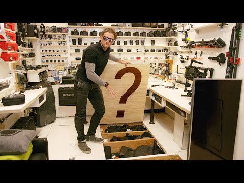
Casey Neistat's Deeply Functional Studio
Casey Neistat has been transformed into a spirit animal in my mind. His ethos rejuvenates me everyday and often when I feel a bit down, I turn to one of his vlogs. His vlogs works because he has mastered the art of being authentic. And his authenticity flows into the unique space that is his studio space. The space is designed on a simple, but profound philosophy that has washed over my entire perspective over how I view the space around us and the products that fill them. As described by MKBHD, his studio exemplifies two ideas:
- Build Over Buy
- Highly organized to make the most Functional Use of Space
I highly recommend you to feast your eyes at the beauty that Casey's studio is, through the crisp camera-work of Marques Brownlee.
Did you read through all of it? If yes, I couldn't be more grateful. These letters take more work than I anticipated it to be. But I get a thrill every time I finish one of these letters and publish. Lately, I've been realizing how ideas at the frontier of our civilization don't have time to go through books, let alone institutions in todyay's day and age. Ideas on the cutting-edge are packaged in tweets and newsletters, and there seems to be no going back. Recently, a foundational idea for Product Design, titled Atomic Concept by Kevin Kwok, published just a month ago, became the centerpiece of my deliverable for a company I am helping take to market.
Please let a few of friends know about Productize Philosophy. Just copy this link and share: https://www.abhishek1point0.com/newsletter
Or, give me a shoutout on Social Media:
Share this NewsLetter on Twitter | LinkedIn | Facebook | Pinterest | Mail to Someone
Do reply, and as always any thoughts, criticisms and feedback, is most valued.
Talk Soon,
Abhishek Agarwal
Blog | Twitter
- Check out the Free Email Course: "How to Productively Consume Information Online"
- Manifesto for my software product: "Project MEMEX Manifesto"
- My Website.